CURRENTS MERCH DESIGN
In 2020 one of my favourite bands “Currents” ran a contest to design merchandise based on their latest album “The Way It Ends”. We could submit 3 designs.
I was incredibly happy with the designs and concepts I came up with so here are my submissions.

"THE WAY IT ENDS"
FLASH SHEET
One of the first ideas I had for this contest was to create something that represented the whole album. It is an album that hits on so many various themes and topics and I felt that an interesting way to do that was to represent each song from the album as a tattoo design and to put them all together in a flash sheet style design. Each design is numbered in order to match the track order and I feel that I have picked up on unique and interesting aspects of each song to turn into illustrations. I am hoping that true fans of the band will be able to look at each design and make a connection to which song it comes from.


"MONSTERS"
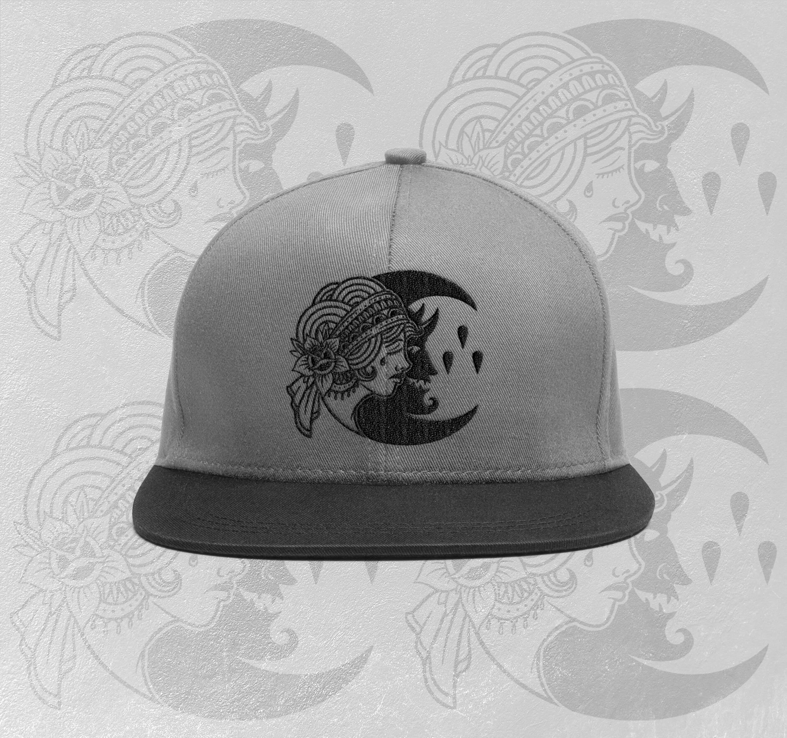
Whilst coming up with concepts for each song for the previous Flash Sheet design I came up with this concept for the song “Monsters”. As one of my favourites on the album I was familiar with the lyrics but the deeper I looked into them the more I got this idea of two sides being shown to replicate that sense of two people in a relationship or the two sides that people show, or the way that being with that person brings out the bad side of you. I love working with traditional style tattoo illustrations so this image of a woman when viewed one way and a demon/ devil when the image is flipped seemed like an interesting way to go.
I really like the idea of the same image being flipped and to see one version on the front and one on the back. I also like the idea of the demon/devil being behind the wearers back.
I have also included subtle connections to the band without just using your existing logo. Eagle eyed fans that pay close attention to the necklace and earrings will notice the iconic imagery of the moon with the 3 drips that will work either way the image is rotated.
I decided to include the chorus lyrics that would be added to a long sleeve or a hoodie design just to reinforce the connection to the song “Monsters”.
“I am not the one to blame” along the left sleeve and “for the monsters we’ve become” on the right sleeve. This text could be coloured or printed in any suitable colour to match the chosen clothing, but I think the red really makes it stand out on the white tee.


"I LET THE DEVIL IN"
Finally I wanted to create something based on their logo. I have always loved it but wanted to build on it and create a more illustrated version that still keeps the feel of the original.
The design was initially intended to be the pocket illustration for another shirt design but I decided that it was strong enough on its own and would work well on a cap or snapback.
It could also be used on a beanie. I believe that it is developed enough to stand on its own as an illustration but also remains faithful to the original logo.